Many artists draw their inspiration from their teachers. I am one of those artists. I took ceramics in high school simply to try an new media. I ended up falling in love the clay, and I believe that my teachers had much to do with that. I owe my love of ceramics to these teachers: Robert Lawarre and Stephen Heywood. I would like to honor them by display some of my favorite works of theirs.
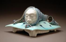
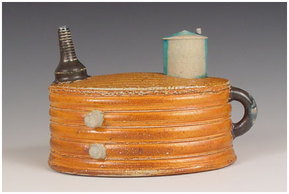
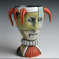
 Robert Lawarre was my High School ceramics teacher. He provided me with an introduction on techniques in hand building. We didn't have wheels so it was all done by hand building. He truly inspired me and I found his works very interesting. Without him I don't think I would love ceramics so much. Thank you for that. I have attached some of my favorite works of his below.
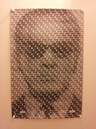
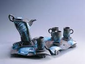
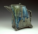
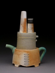
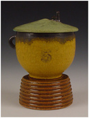
|  Professor Stephen Heywood was my college teacher for Beginning and Intermediate Ceramics. He taught me the basics of wheel throwing and helped me refine those skill and pushed me to make things taller or wider. He taught me how to make lids and pull handles and showed me some tricks of the trade. I loved his laid back style and amazing teaching styles. His classes inspired me to want to teach ceramics to others like he taught me. Thank you for that. I have also attached some of his works below.
|
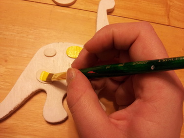
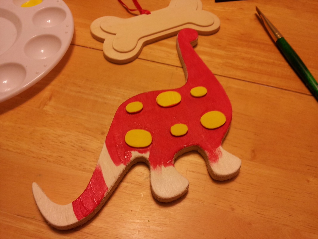
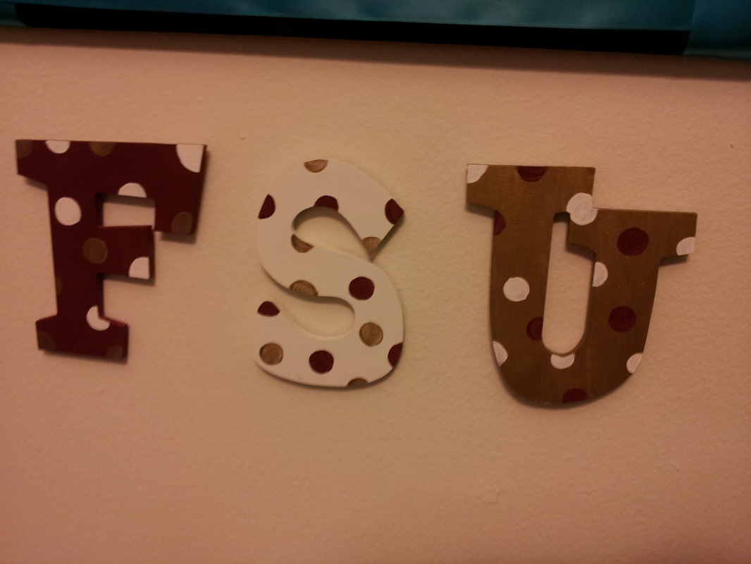
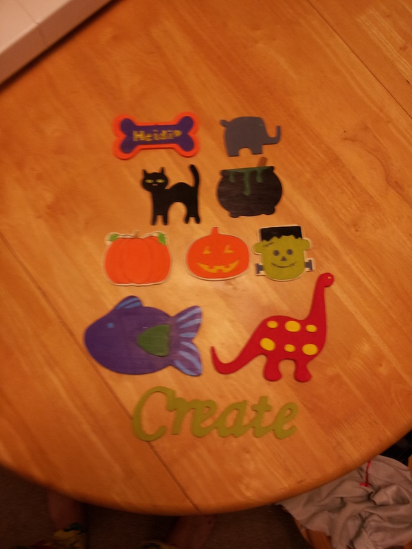
It may not be considered art to some but I think that sometimes art is done in order to relax. Buying pre-cut wooden shapes or words and adding color to them is just pure fun. I can sometimes even buy shapes or thing that I feel represent me. I even use some of the wood pieces to decorate my house. I believe that this would qualify as art in the interior design sector. Although wall decorations are a small part of interior design, for those of us with a small budget, these wooden wall hangings can brighten up a space a lot.
These are just some picture of things I chose to do. I chose the dinosaur because I work at Jurassic Park, The FSU letters were from when I got my acceptance letter, and the Halloween ones are for seasonal decoration purposes. The fish is because I am a pieces. I also have a Jacksonville Jaguar star that I painted.
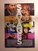
I collect movie posters. I am in love with movies and these allow me to capture an artistic glimpse of these movies I might not have seen before. I like that when you look at them, you can immediately begin to replay scenes in you head if you have seen these movies. These posters all show an artistic rendering of the movie itself and aims to make the viewer want to see or feel something for the movie. Yes, most of these are all real movie posters that would be in the display cases outside the theaters. Gone with the Wind, Jurassic Park, and Starship Troopers are reprints. Interesting fact for someone who has never seen or held an original poster, they are all double side printed and come in a size of 40 x 37 inches. Framing is difficult. Some of these are mini posters used to promote these films in areas without the cases in front of theaters. For example, Avengers, MIB3, and How to Train Your Dragon. The rest are original prints in the 40"x37" format. Enjoy!
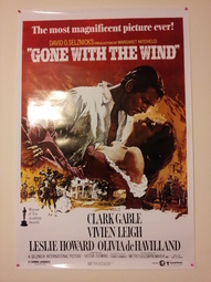 Gone With the Wind. A Classic! This movie poster uses a portraiture approach in that it was created in the style of pre-technological advancements. There is careful consideration in what makes the cut to be on the poster in order to spark thoughts about the movie and to make you want to see it. These posters are a visual scene from the movie that should be representational of the movie itself.
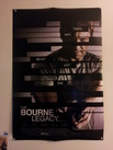 Bourne Legacy. This poster in particular is very much art. The slats that overlay the scene distort the image but still create a thought provoking image. Rather than provide a clear image, this one is cleverly laid out in pieces that activates the mind.
| 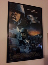 Starship Troopers. If anyone has seen this movie then you understand that this is an artistic version of sci-fi. Some of the scenes in this movie and the special effects are slightly lacking and make the movie seem like it was made on a very low budget. Again, this picture is supposed to make you want to see it and represents the story in a single image. If you haven't seen this movie you should watch it. The first one is good the other two, not so much.
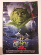 The Grinch! Based on an illustrated children's story. This is simply a new rendition of those drawings. Its a mixing of present media with past subject matter. That makes this a multi-media poster.
|
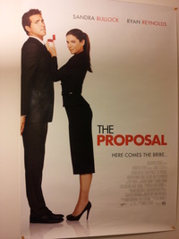 The Proposal. Great Movie. Simplistic poster. Simply conveys that this may not be a proposal that he is thrilled with.
|  This one is similar to the Bourne Legacy in that it uses the slat structure. However, this one provides several different scenes and multiple characters. This image is art because of the use of dynamic color and story telling.
| 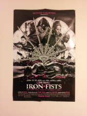 The Iron Fist is made by cult legend Tarantino! I didn't actually see this one but the art work in the fan to represent the characters and the story really remind me of collage work!!!
|
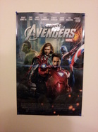 The Avengers. It's art. It's based on a comic.
| 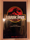 Jurassic Park. Another Classic! Also my current employer. Simple use of contrasting colors and logo recognition.
|  MIB3. This is amazing. It is designed to play with the eye like magic eye. That's kinda like what some art is meant to do.
| 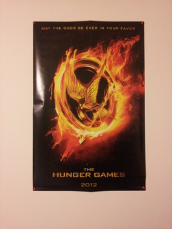 The Hunger Games. Clever use of logo and fire. Also contrasting colors.
|
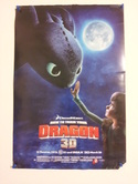 How to Train Your Dragon. An animated film.
| 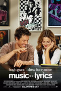 Music and Lyrics. Uses posters within posters. A meta advertisement.
| 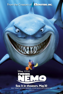 Finding Nemo. Also Animated.
| 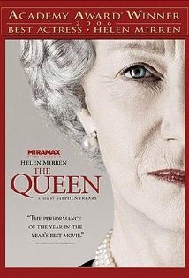 The Queen With Helen Mirren. Kinda looks like a portrait.
|
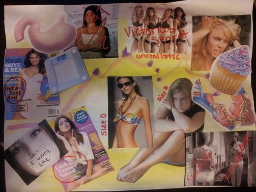
America is setting unreasonable goals for young women. All the magazines and trends that we are supposed to read and follow use models that are way too skinny. I have my own issues with weight and sometimes when I read Cosmo, I get to the point where I want to cry. I have always felt like I was overweight and I have struggled with it for a long time. I am trying to change that by eating better and working out, but the process takes some time and I still get upset sometimes. This image is a personal reflection of my thoughts on society and self image. I used the body parts of the stomach and heart to represent what actually matters. It is only important that these organs are healthy even though they don't necessarily look beautiful. Also the heart has been broken in order to reflect the negative and hurtful feelings that result from being told you aren't skinny enough.
 RSS Feed